Overview
Art on the spot is a premier private art event coordinator that specializes managing unique art parties for people of all ages. For this client I was asked to design their first logo as well as design and develop their initial website.
Note: the official website is no longer active. This link will take you to a mirror of the site.
Logo Design
For this design I spoke with the client extensively about the goals, image, and personality of the company. From these conversations I was able to determine that fundamental requirements for the logo was that it immediately portrayed a relation to art while being fun and relatable. We also wanted to ensure that entirety of the name could be present without seeming to static or imposing. And, most importantly, the logo needed to be fun.
In order to capture all of this, I designed a logo that used a common pallet board board as a background. This created a canvas to contain the full company name. I then played with fonts and colors to design the name. For the ART in the name, I used a brush stroke with each letter using a different color from the main brand colors. For the rest of the name, I used a san serif, calligraphy-style font in black with the o in Spot depicted as a paint blot.
Web Design
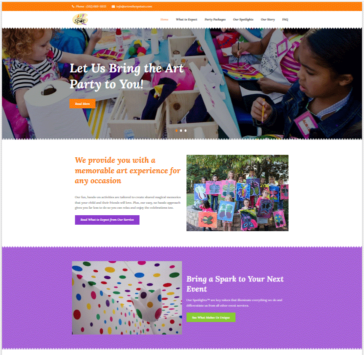
Here, again, I worked closely with the client to determine the best theme for the site. We decided to make the site feel vibrant and fun. For this the client chose an array of vibrant colors to use for the brand and we encapsulated the fun atmosphere by giving the colors inspiring names like Passionate Purple.
I then worked on choosing a good WordPress them for the site. I chose a theme that used a rainbow of colors which we replaced with the new branded colors. It also uses a jagged edge motif on banners which elicits the feel of grade school art class and cutting construction paper. We duplicated the jagged edges and liberal use of colors through out the site to further enhance the art class feel and childhood nostalgia.
Web Development
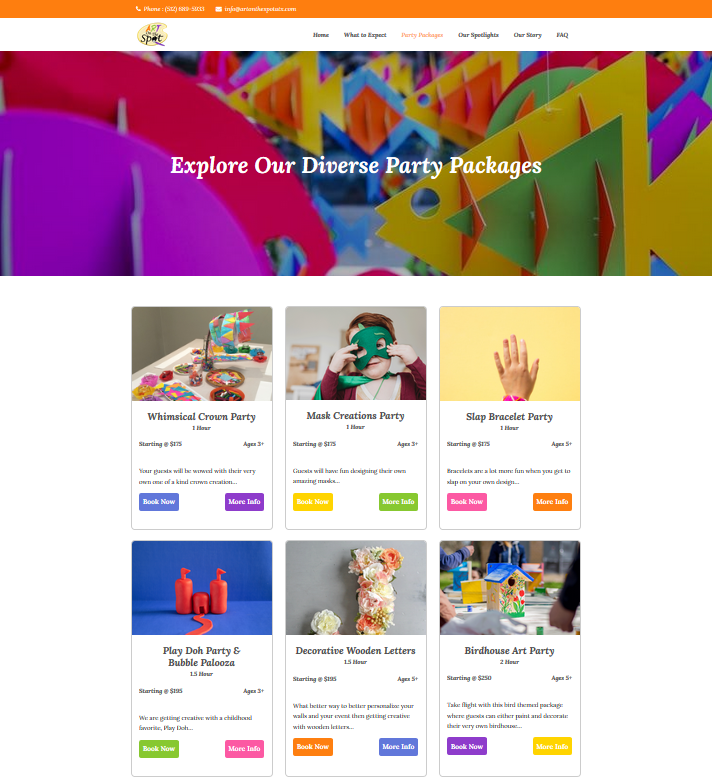
For the development of the site, we focused heavily on the customer journey and understanding our target audiences. We wanted the home page to quickly explain what Art on the Spot is and then guide the visitor through a journey according to their level of interest and / or purchase readiness. For this reason we focused on presenting initial options that define what the service / product is & how it works, highlight potential uses of the service, and outline the various options available with the service in the form of party packages.
With the party packages, we continued to focus heavily on informative details by giving each a descriptive name, being upfront with pricing & limitations, and providing two options for proceeding. One option allows the visitor to quickly and instantly book a party of their choosing for any available date and time that they wish. The other option allows the visitor to request more information about the service in general or any specific party package. This approach of offering both a soft sell and hard sell acknowledges the variety in the potential customer base for the service and ensures that we have an option available for everyone, no matter where an individual is in the purchasing process.